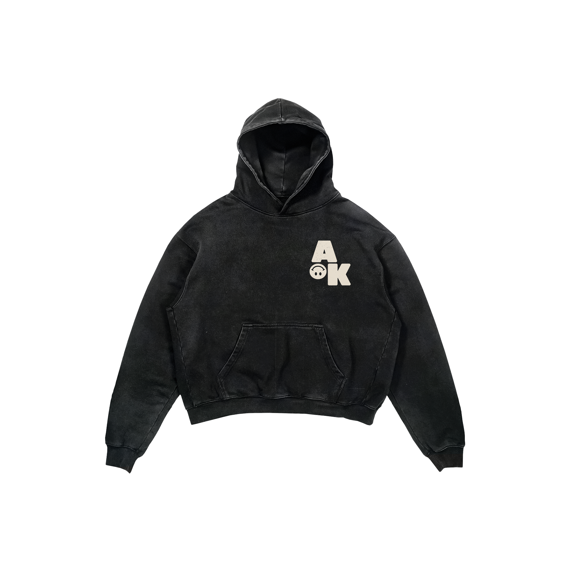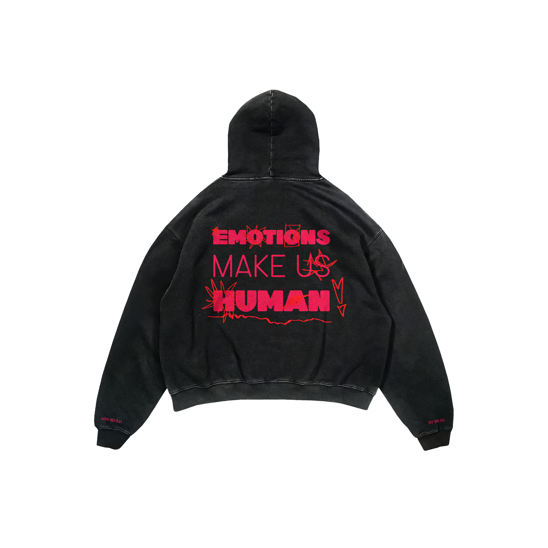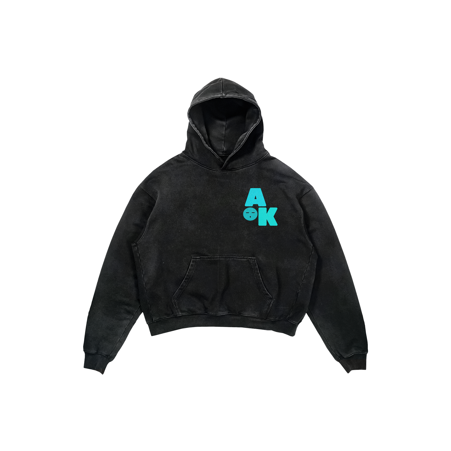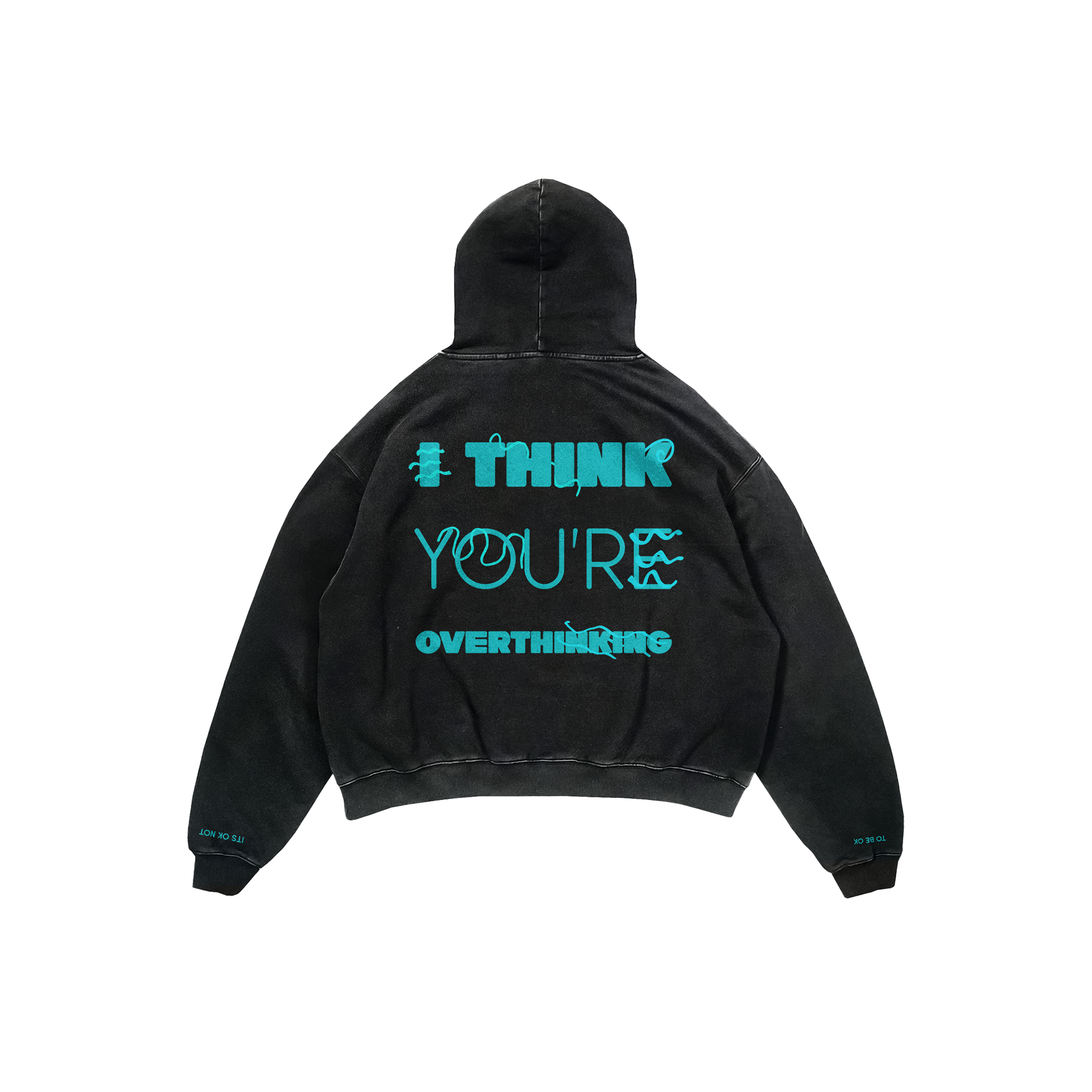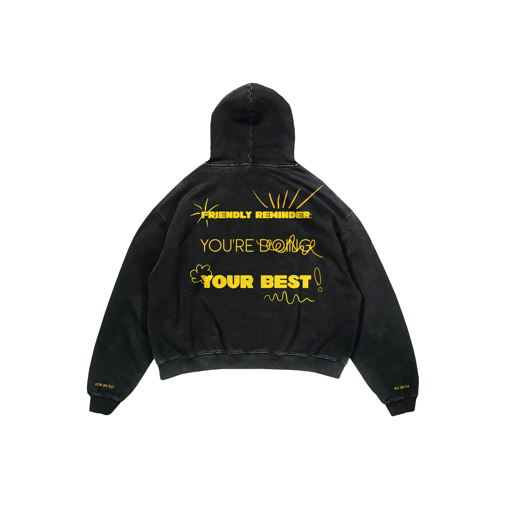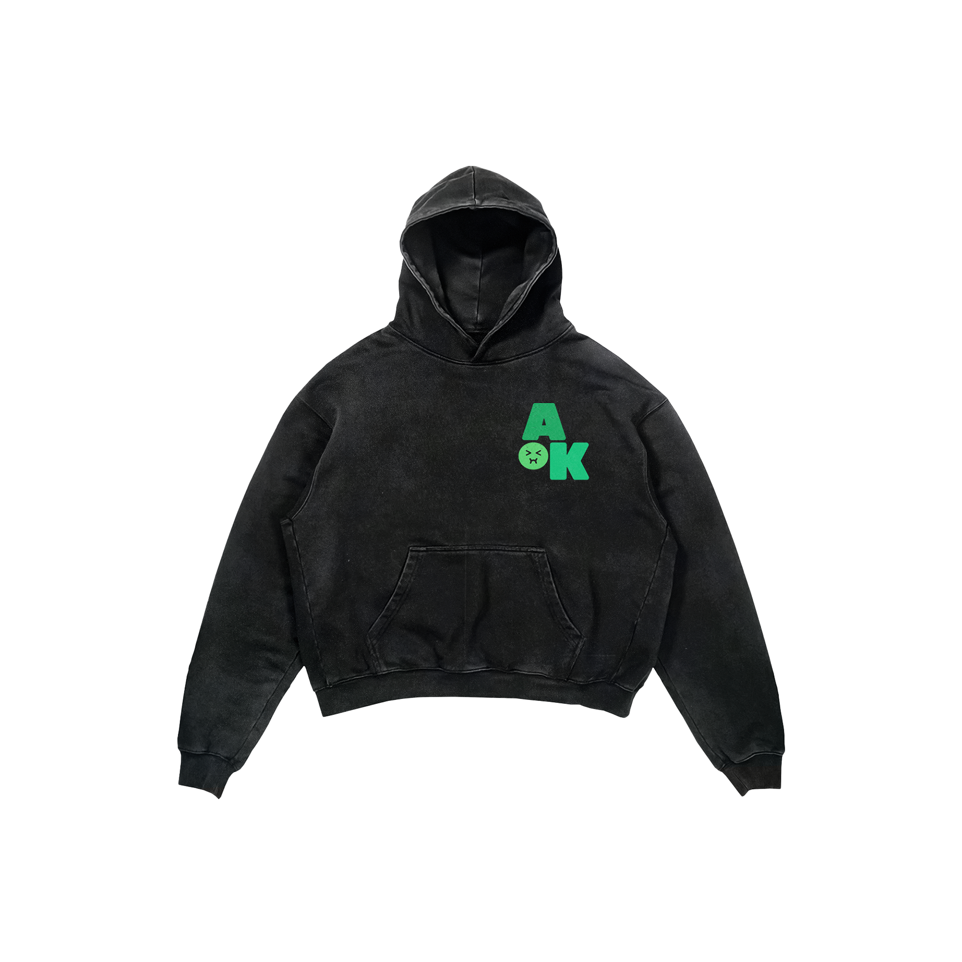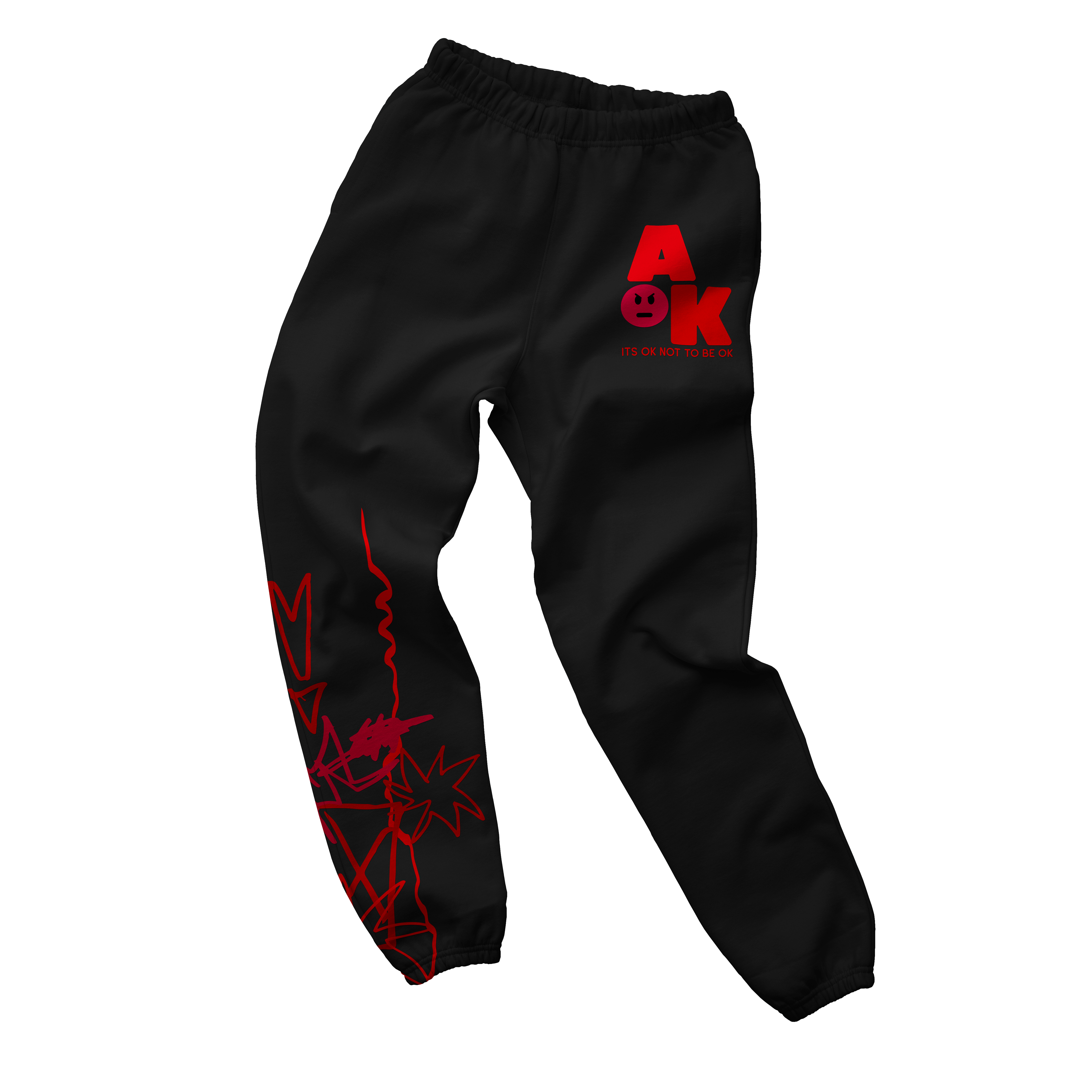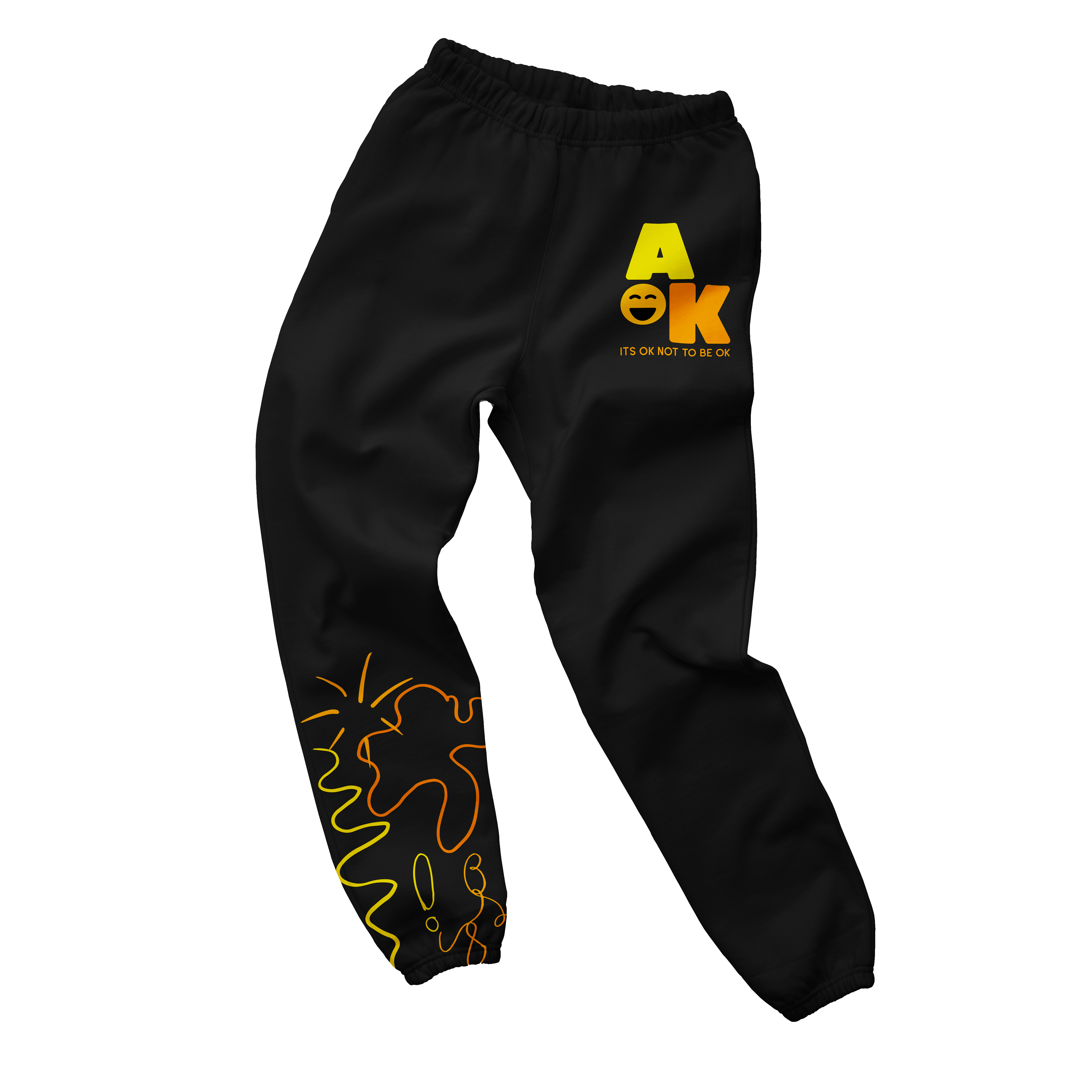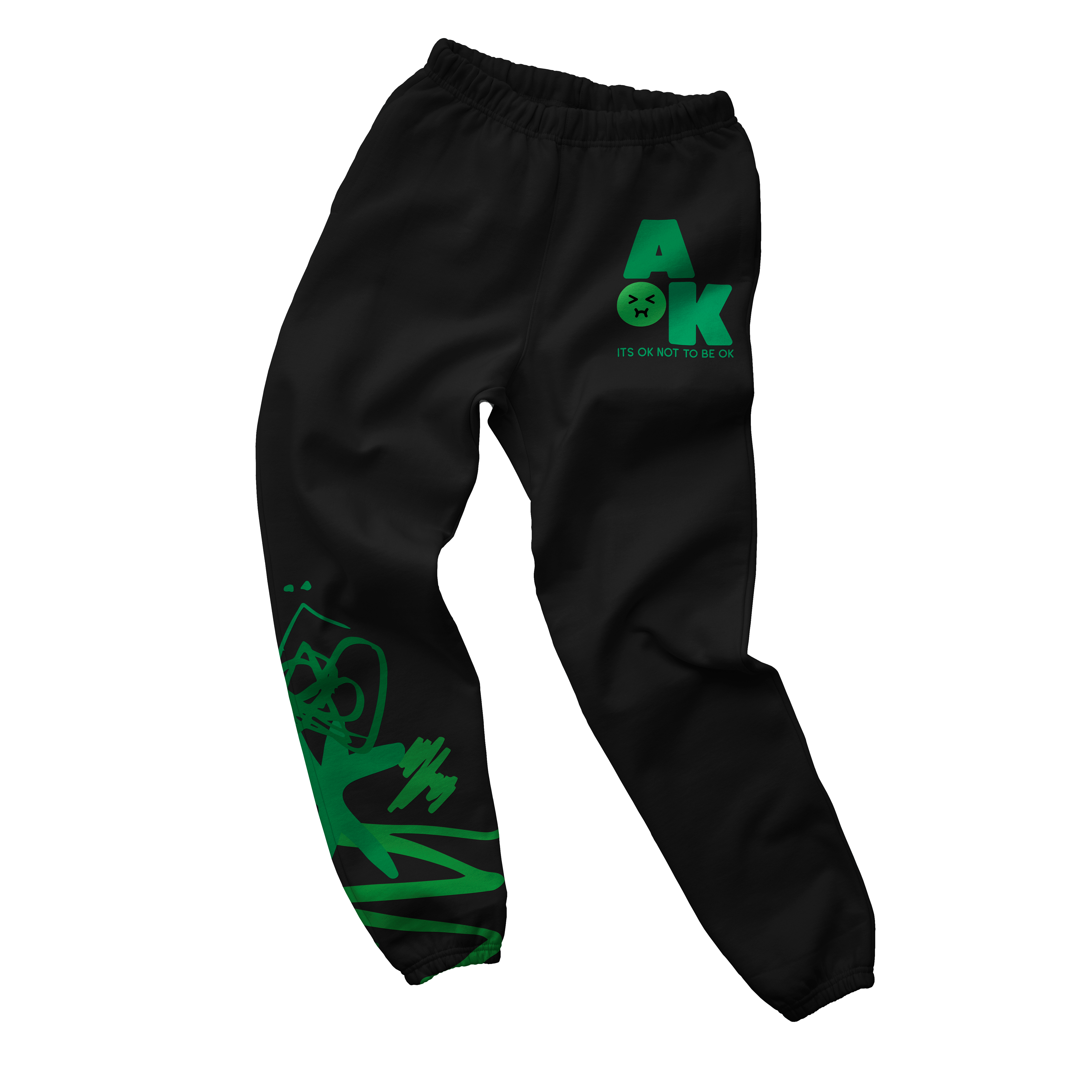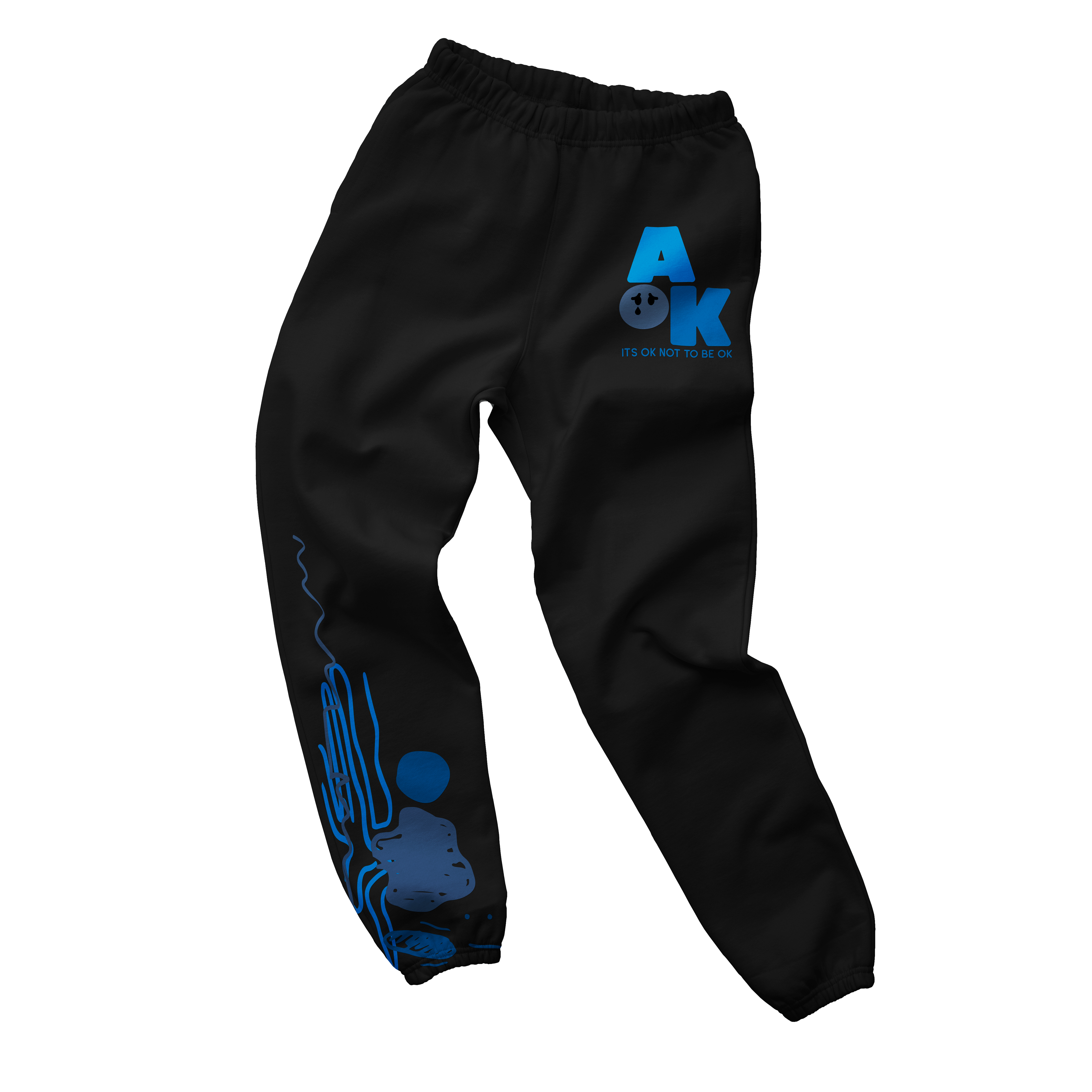
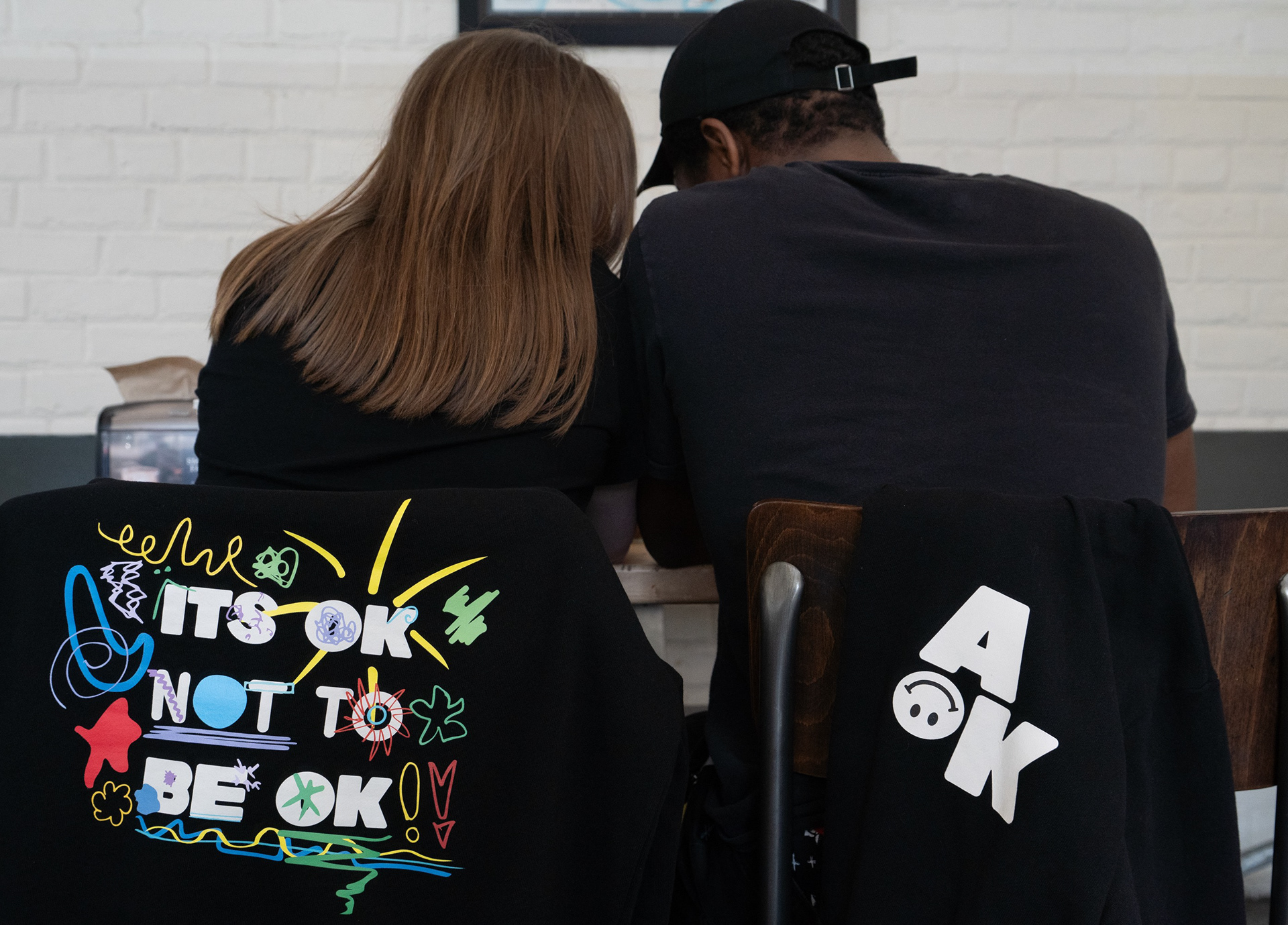
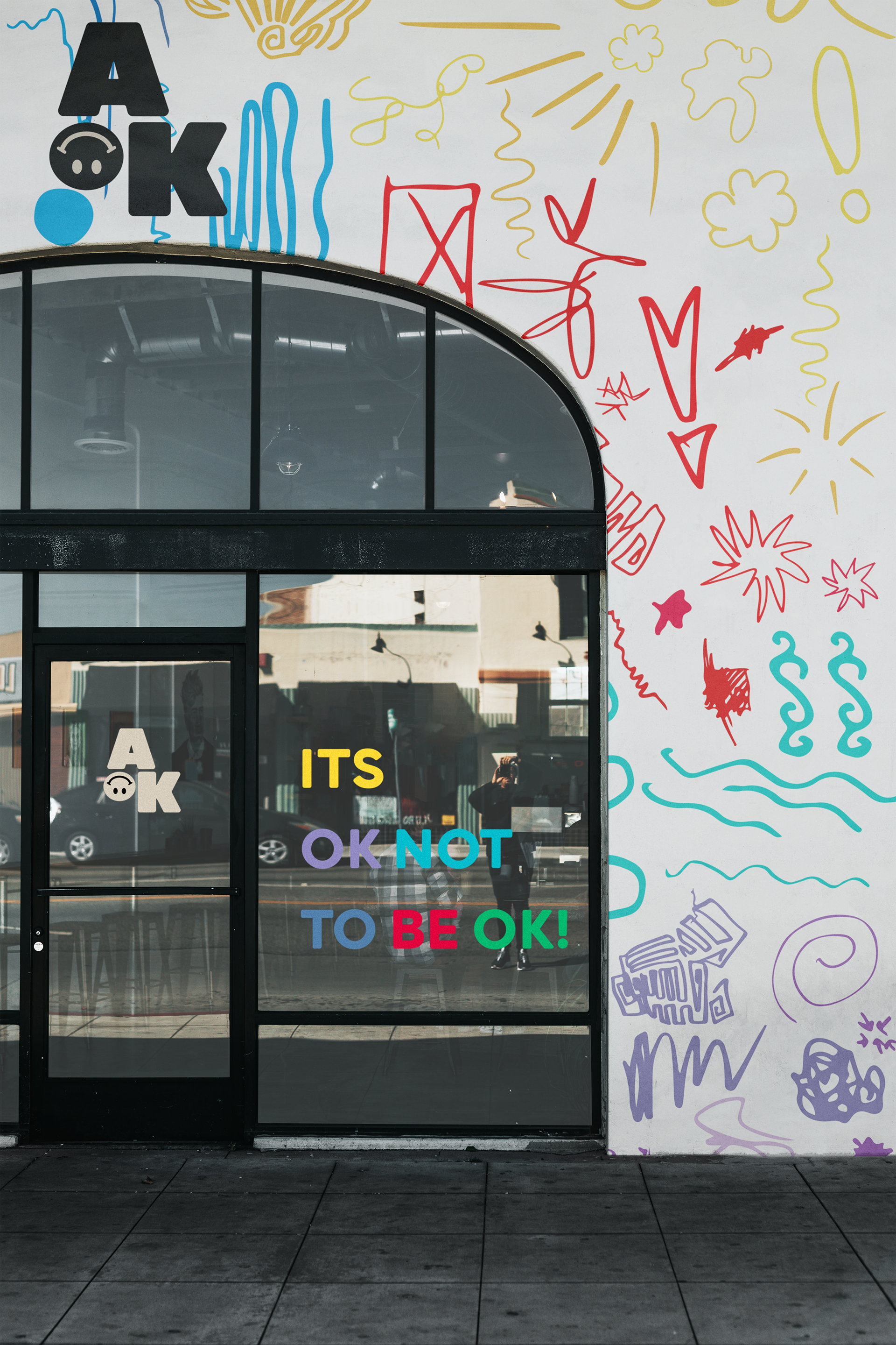
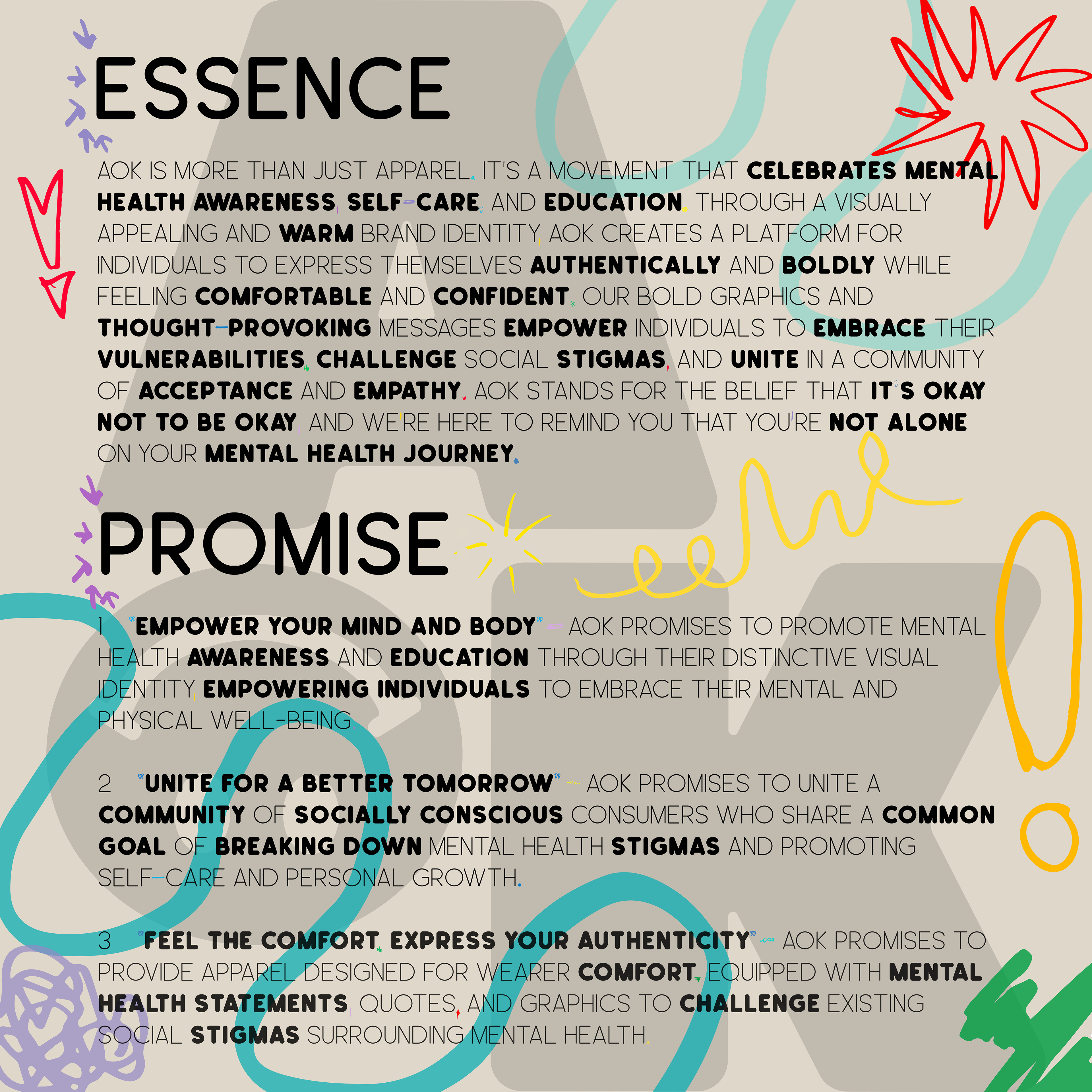
AOK is more than just apparel. It's a movement that celebrates mental health awareness and education. Through a visually appealing and warm brand identity, AOK creates a platform for individuals to express themselves authentically and boldly while feeling comfortable and confident. Our bold graphics and thought-provoking messages empower individuals to embrace their vulnerabilities, challenge social stigmas, and unite in a community of acceptance and empathy. AOK stands for the belief that it’s okay not to be okay, and we’re here to remind you that you’re not alone on your mental health journey. To shop the collection go to http://shop-aok.com
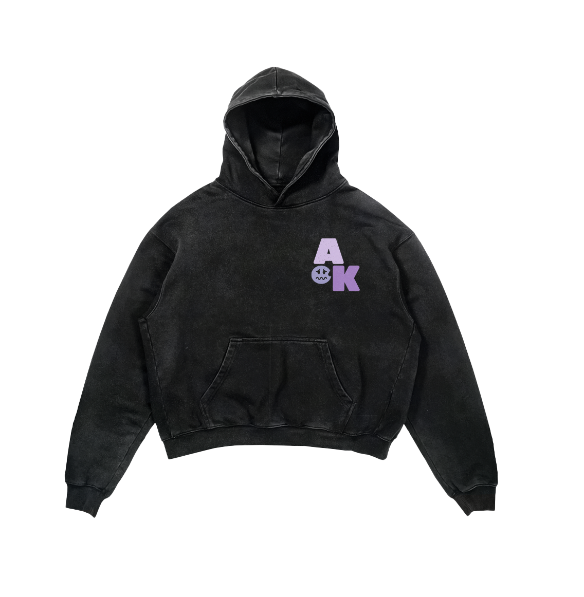
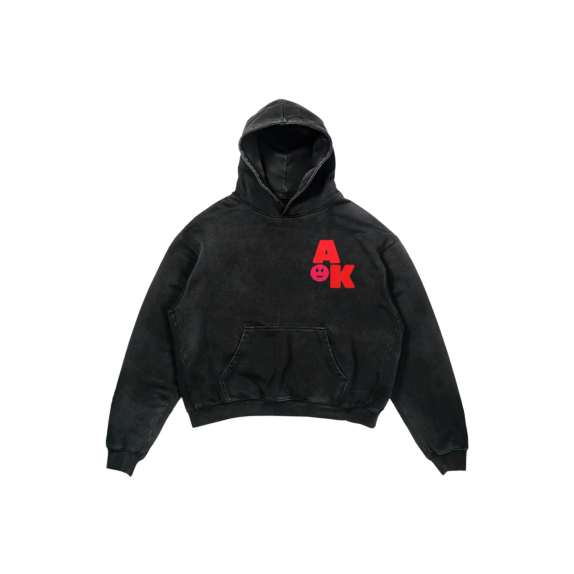
The Color System
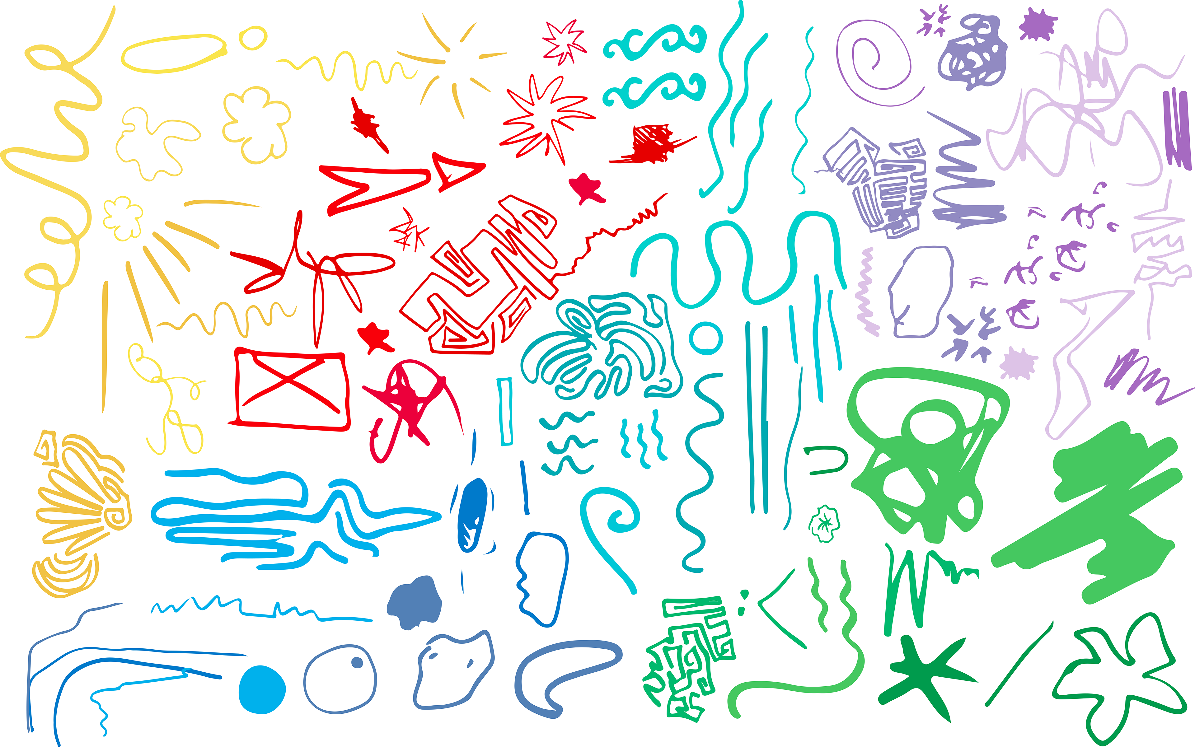
For each AOK emotion I created three different shades of the same color. I liked the idea that emotions are not one dimensional and can be felt at different intensities. The lighter shades represent a softer or more surface level feeling while the darker shades show a deeper or heavier intensity. It was important to me to have that range because it makes the brand feel more honest. Sometimes you feel just a little anxious and other times it is overwhelming, and the colors reflect that spectrum.
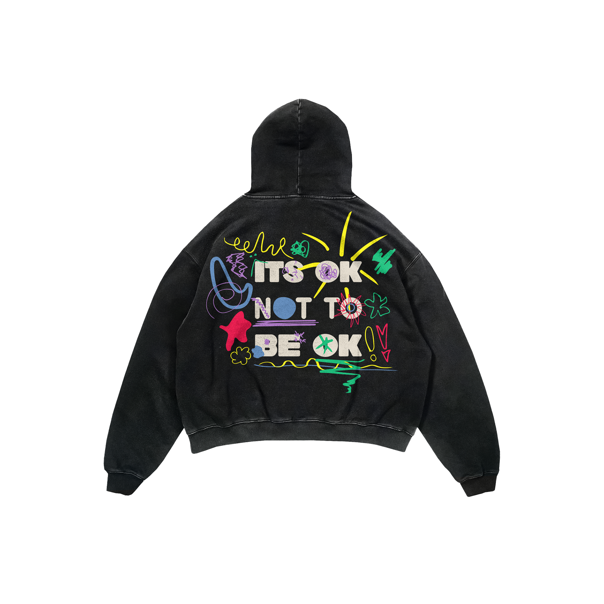
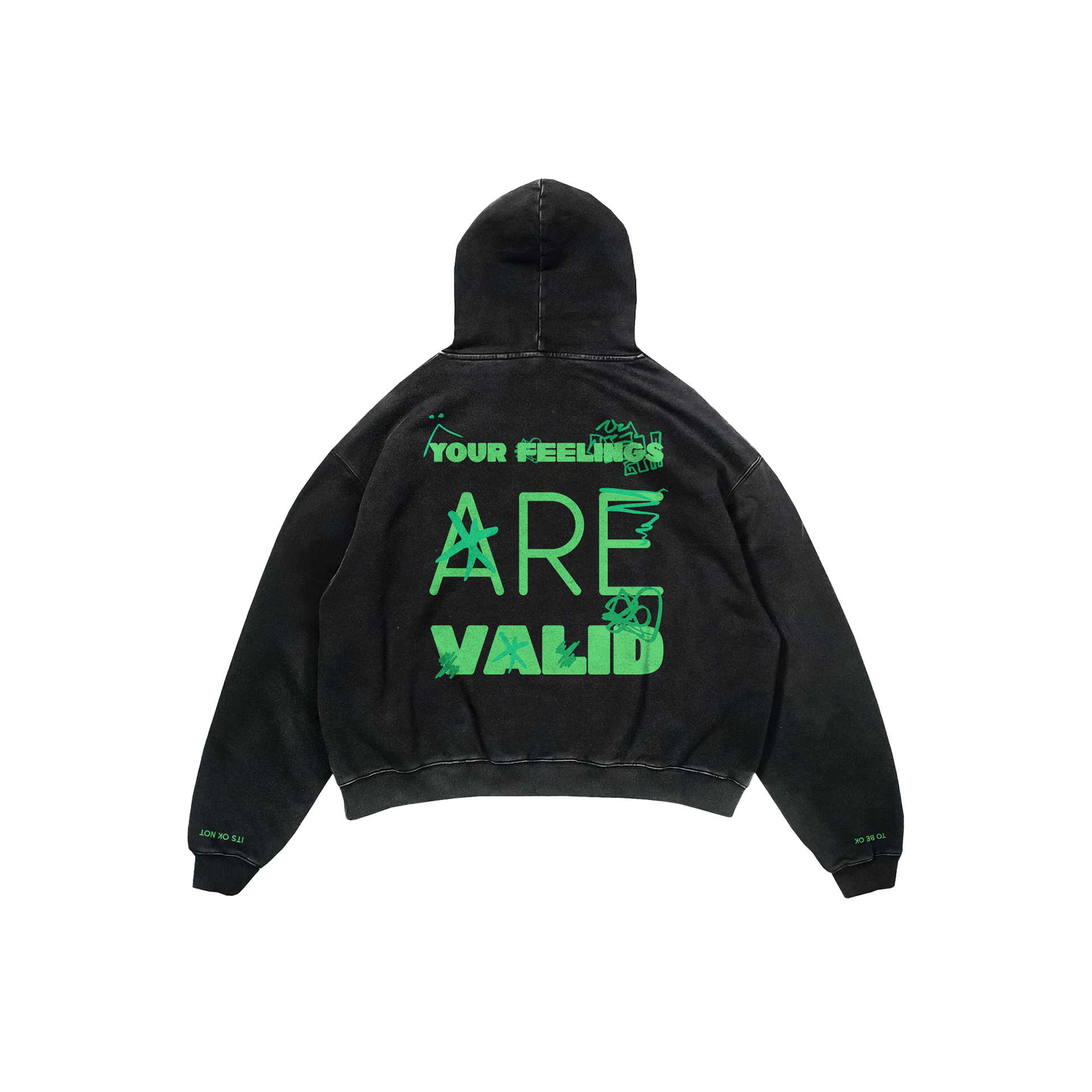
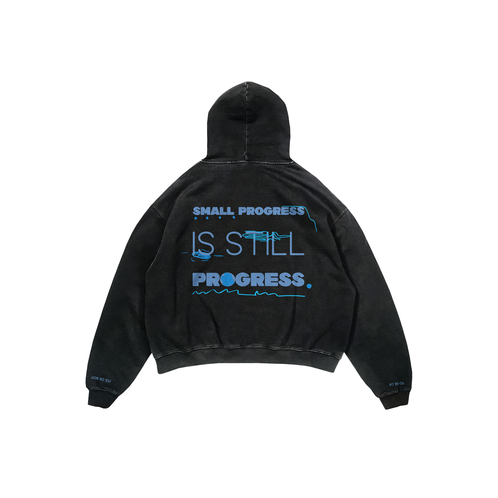
The Doodle Process
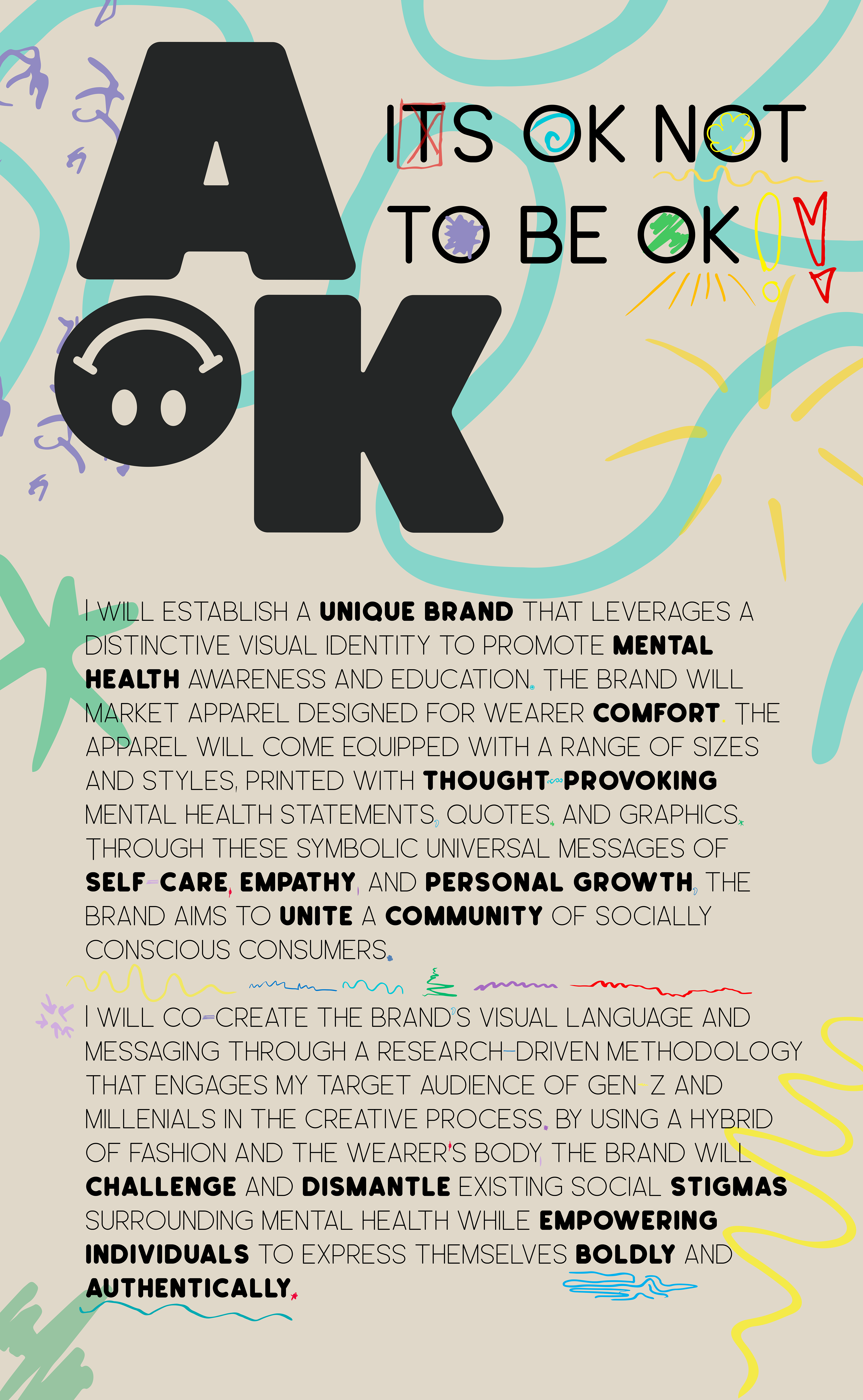
When I started AOK I wanted to make customized hoodies but that wasn’t realistic, so I came up with a way to still make the brand feel personal. I write out the AOK emotions like cheerful, depression, anxiety, calm, disgust, and anger and ask people to doodle whatever shape or form comes to mind. Each doodle is different, which I love. I scan them in, give them the color tied to that emotion, and then work them into merch or other brand pieces.
It has become one of my favorite parts of AOK because it shows how everyone interprets emotions differently. The doodles make the designs more collaborative and help highlight the whole point of the brand: creating space for people to express their feelings openly and in their own way.
Clothes: