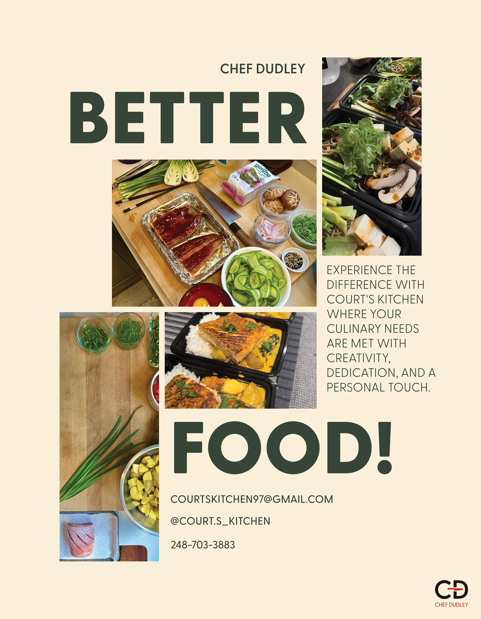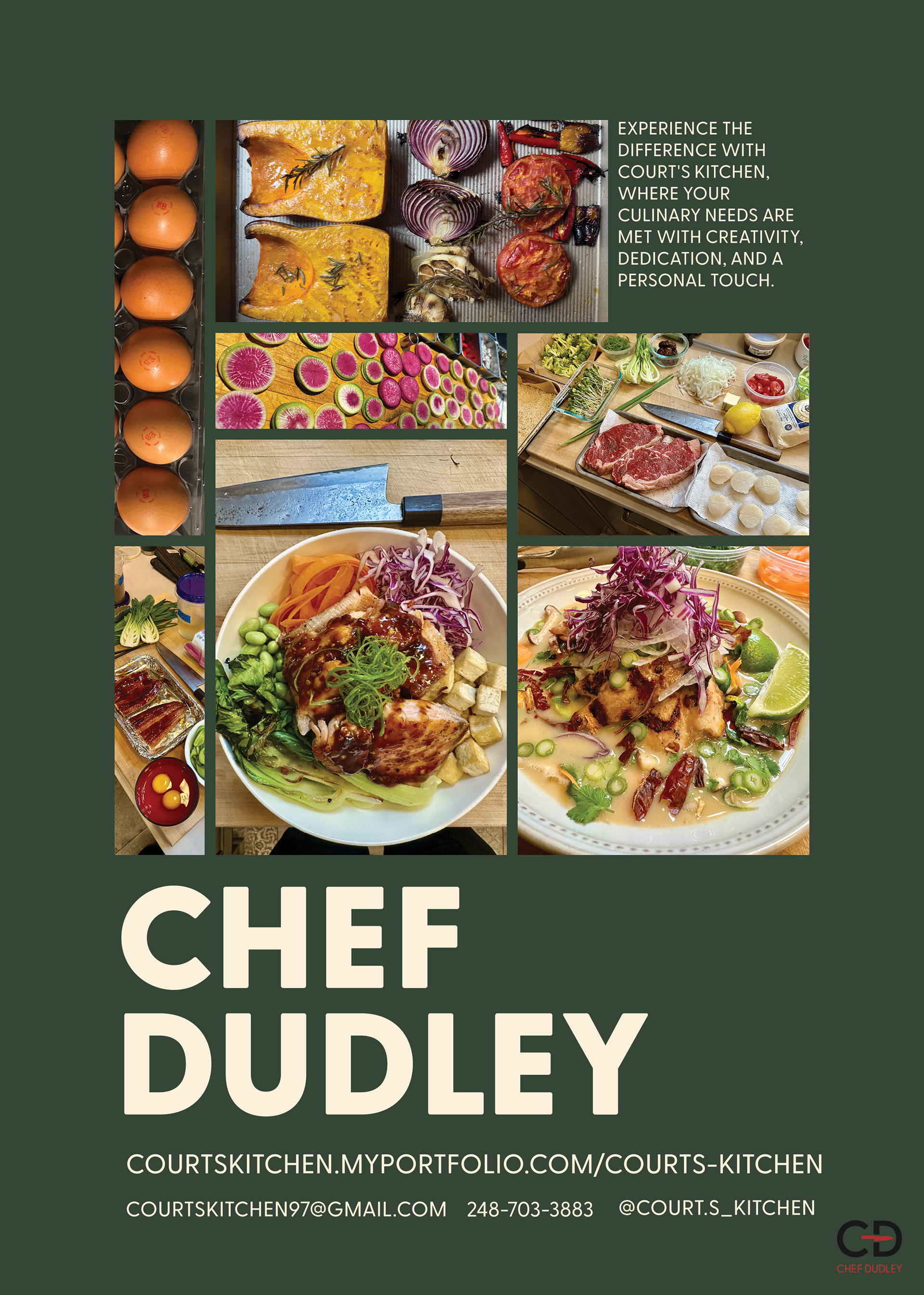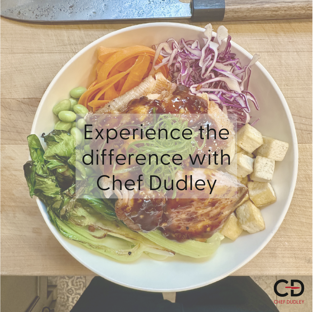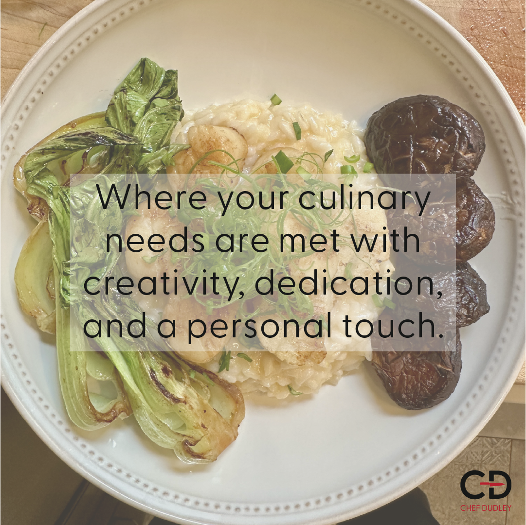
Chef Dudley is the evolution of Court’s Kitchen, a brand I have been closely involved with from the start. What began as my boyfriend’s personal chef venture has grown into a business that highlights his skills outside of the traditional restaurant world. I have helped build the brand identity from the ground up, designing the logo, flyers, business cards, and custom menus, all with the goal of giving his services a professional yet personal feel. While the name Chef Dudley puts the spotlight on him, Court’s Kitchen still represents the roots of his culinary journey, and together the two identities tell the full story of his passion for cooking and hospitality.
The Logo and Meaning
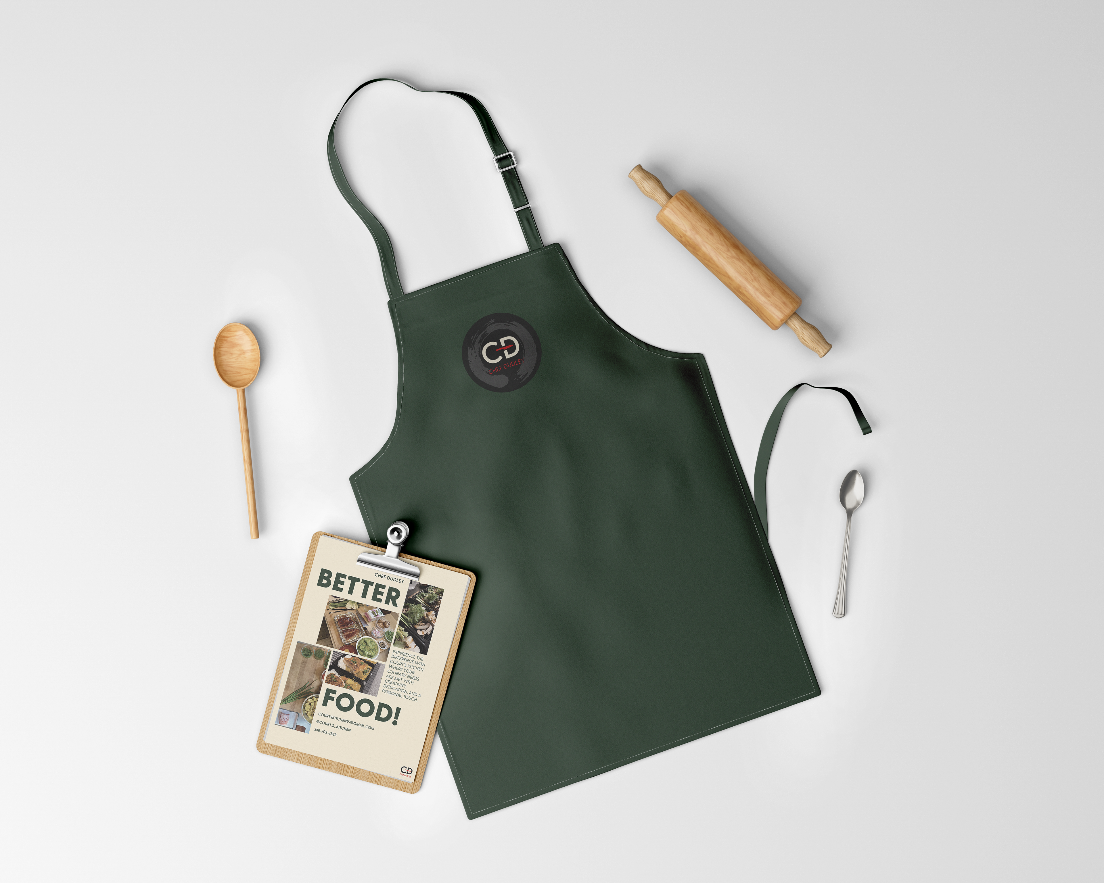
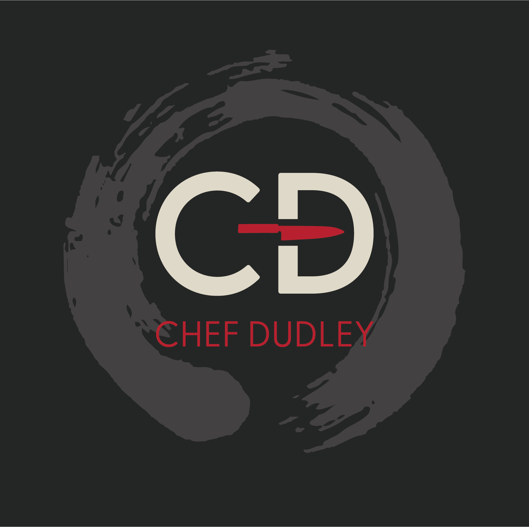
When I rebranded Court’s Kitchen into Chef Dudley, I shifted the logo from CK to CD. It felt more personal since CD are his initials, and it also allowed us to keep Court’s Kitchen as a sub-brand while introducing him as Chef Dudley.
The logo features a gyuto knife, one of Courtney’s favorites. As a chef, he has a collection of Japanese knives that he takes great care of, and the gyuto is one he uses often. Including it in the logo was a way to represent not only his tools but also his respect for his craft. Courtney loves cooking all types of cuisine, but Asian cuisine is a personal favorite, which made the gyuto feel like a natural tie in.
Around the CD, there’s a swish element that works in a few ways. It references plating techniques, like the way chefs swirl sauce on a plate, but it also doubles as the shape of a plate itself. To me, it symbolizes how Courtney is essentially “serving” himself through his craft, offering his skills, passion, and creativity directly to the families and people he cooks for.